Is the new TTC system map easier to read?
The Toronto Transit Commission is seeking public input on its new system map, the wayfinding image that's supposed to be an easy-to-read, comprehensive overview of all subway, streetcar, and bus lines.
The TTC announced it would be overhauling the cluttered system map in October last year as part of a general commitment to better design. The plan to number the subway lines and create a new set of standards for internal signage was revealed at the same time.
Recently, as part of promises made in the TTC customer charter, the mess of handwritten signs and other detritus has been gradually stripped from many subway ticket booths, too.
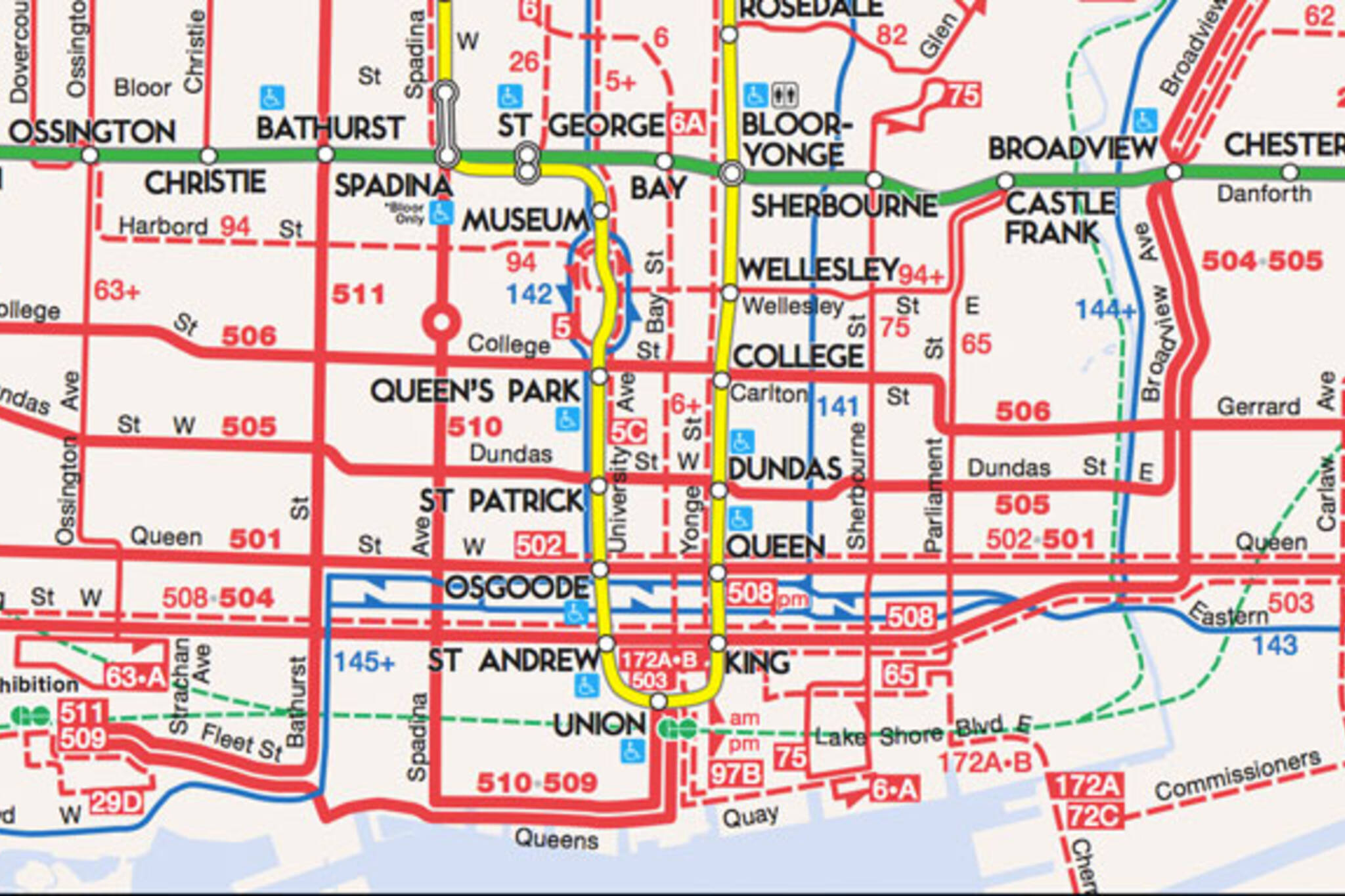
Without the old map for comparison, not much is different. The green and yellow of the Yonge-University-Spadina and Bloor-Danforth lines (sorry, Line 1 and Line 2) stand out better against the pastel background and bus and streetcar routes are still bright red, though easier to distinguish.
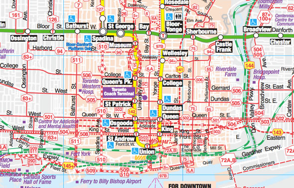
The design overhaul is more a case of addition by subtraction. Gone are streets not served by public transit, landmarks like the Centre for Addiction and Mental Health, Fort York, and Riverdale Farm, and other landmarks deemed unnecessary visual clutter. What's left is a simplified overview of public transit, including express and community bus routes.
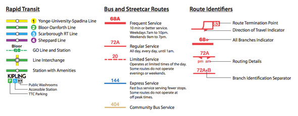
A thick red line indicates a line, bus or streetcar, with service every 10 minutes or less. Thinner red lines are reserved for surface routes with all-day service. Dashes are used for infrequent or limited services. For TTC purists, the much-loved subway font makes a return on subway stop labels.
The TTC is seeking customer feedback via an online web survey. The deadline to add your thoughts is in March. The full version of the system map, available as six individual panels or one massive city-wide view, is available here. For comparison, the last edition of the old design is still online at the TTC website. The final version of the new map will be printed in next season's Ride Guide.
What do you think of the new look? Will the TTC's focus on better design result in better customer service?
Chris Bateman is a staff writer at blogTO. Follow him on Twitter at @chrisbateman.
Images: TTC
Latest Videos
Latest Videos
Join the conversation Load comments