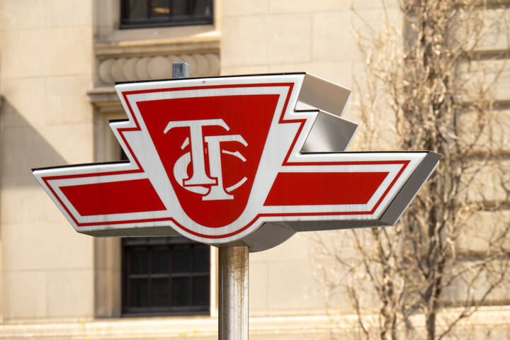
What do you think of this redesigned TTC logo?
It's been a long time since we posted a mock redesign of the TTC logo, but I happened to stumble upon one this morning that I thought worthy of sharing. Designed by Ruta Kardas, it's modern and minimalist appearance seems just the type of thing that a transit agency looking for a symbol of change that might mark a new path or era. The TTC is already at least somewhat up to this in real life with its proposed numbered lines and yet to be revealed new maps, though I'm quite sure the logo will remain intact.
Past mock ups of redesigned TTC logos have come under considerable criticism from armchair designers â sometimes for good reason â but the discussion about TTC branding is almost always entertaining. One point that's often made is that despite what other problems the TTC has, the logo itself is rather strong. I tend to agree with this, and would be disappointed to see it redesigned in any significant way, even as alternative logos and branding fascinate me.
To my taste, this particular logo is a bit too cutesy looking when mocked up on the vehicles, but I've seen far worse efforts. What do you think? Could the TTC use a logo rebrand? Or do you like the status quo?
Latest Videos
Latest Videos
Join the conversation Load comments